Creating Chapter Art
When I first started planning Star Crossed, I genuinely believed the chapter art would be simple. I had visions of simple line art, easily usable software and illusions of grandeur.
Something quick and subtle, just enough to add a little sparkle to the pages. An afternoon tops. Simples.
It was not. The rabbit hole I feel down was a lot of things. Simples it was not. Logically I knew it couldn’t be that easy, anyone that has ever created something knows it is never that easy, but still … I had not been prepared for the effort required.
It started innocently enough.
I tried a few drawing programs, played around with a few designs, nothing was looking right. One minute I was playing with line drawings, and the next I had layer upon layer of watercolor splashes, shadows, erased details, replaced elements, and a very real emotional attachment to a fictional cello.
And that brings me to the next part…
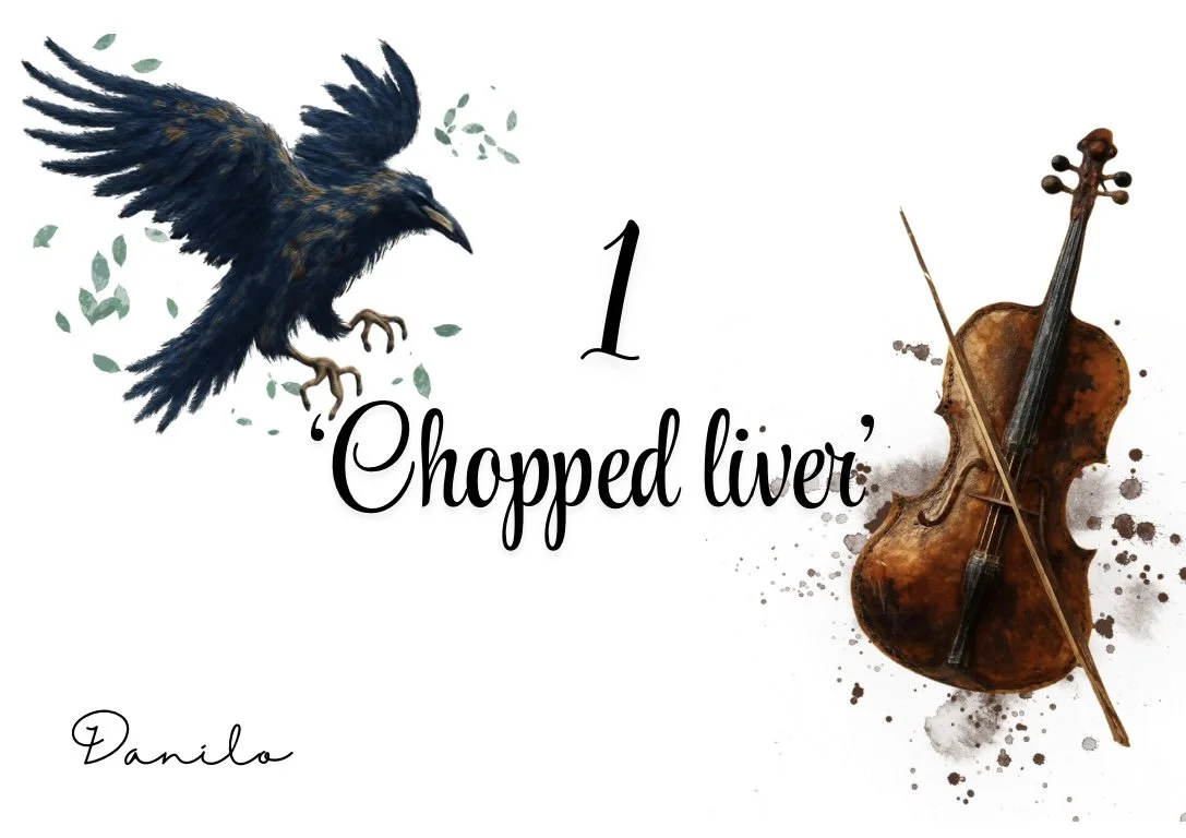
Danilo - The cello saga begins
Copyright YviKmetts 2025
Danilo’s came first because he felt the clearest in my mind, which is hilarious, considering he gave me the most trouble.
Originally, he had a fedora.
Then he had a different fedora.
Then the fedora and I had creative differences.
Once I settled on the cello as his symbol, I thought I was safe. I was wrong. I went through five different cellos, they all hd various problems. One was too formal, too cartoonish, there was one that just felt too intense. The one I loved was so dark that I found myself erasing sections and then re-colouring the instrument by hand so it didn’t disappear into the page - something I spent long hours figuring out how to do. All the his before I even figured out what the secondary image was going to be. I kept showing designs to my colleagues and they kept giving me contradicting feedback, I finally had to decide on his end result, keeping what felt right for his character.
Hopefully that is what I achieved.
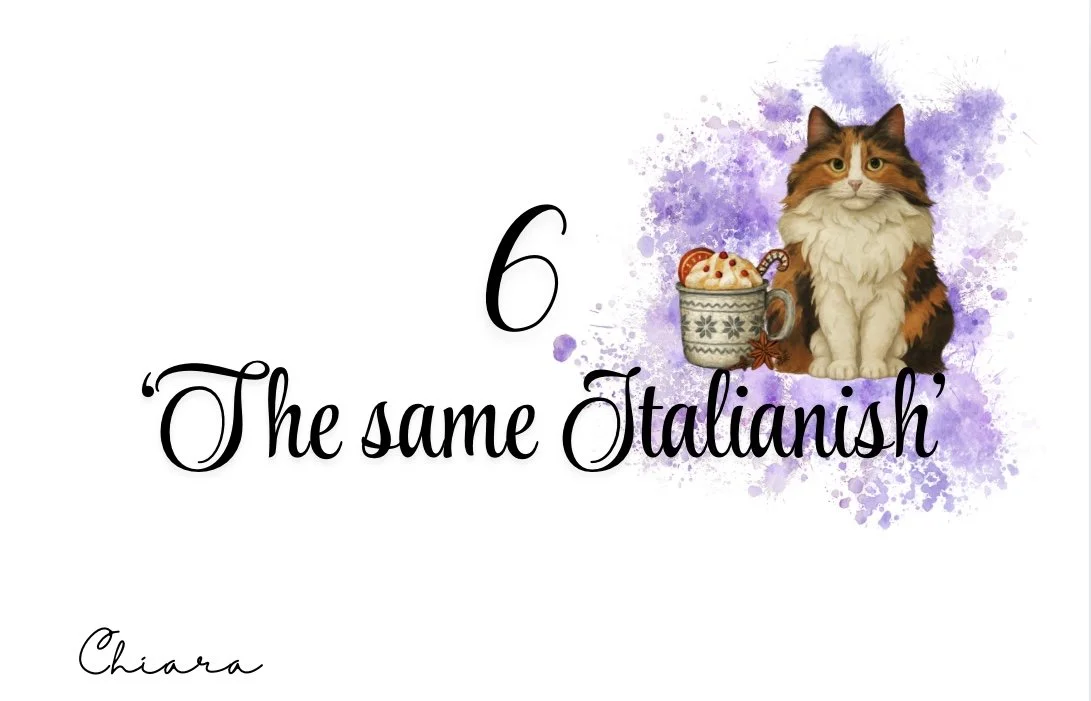
Chiara - The cat, the coffee … all 5 versions … or 9.
Copyright YviKmetts 2025
Chiara’s chapter art was an entire personality journey. Her cat changed more times than I want to admit. There was a time where I thought I would have to change the cat in the book to suit the image (crazy I know) because I just couldn’t get Bartholomew right. Thankfully, I did figure it out in the end. Not sure all my sanity remained intact. Once that problem was solved.
The cup changed.
Once I had made the decision on the cup and the cat.
The entire colour palette had to change. Either it didn’t work with the cat, or the cup or together, or it didn’t feel right.
Once I thought I had everything figured out, someone said it was too busy … the problems seemed never ending.
Then the whole Maeve shenanigans … once again everything had to be changed.
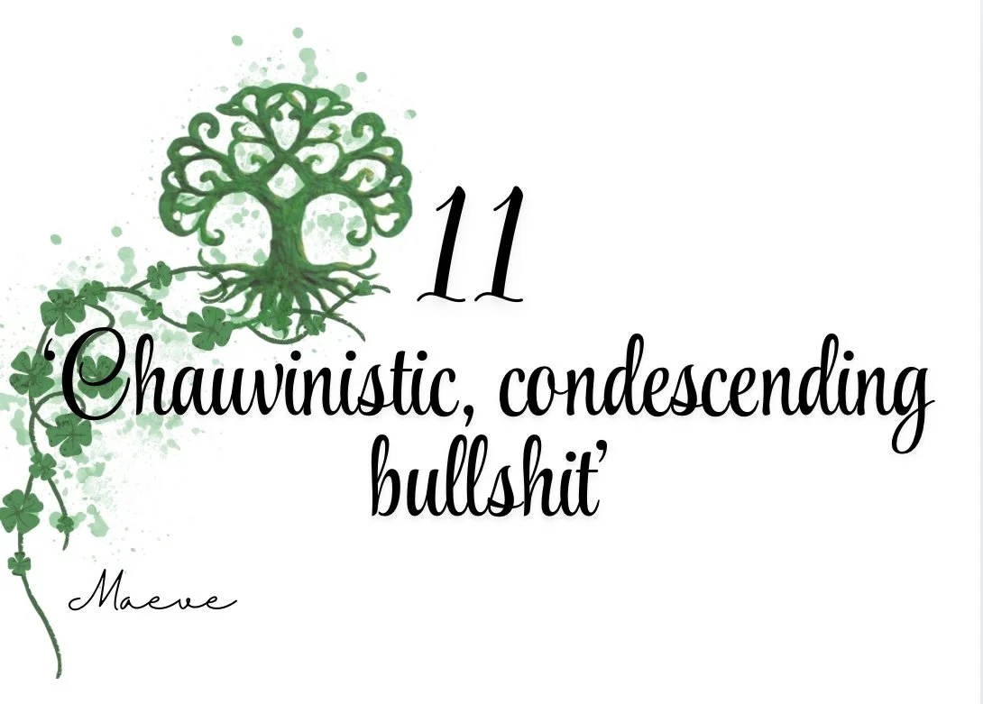
Maeve - The absolute bane of my existence
Copyright YviKmetts 2025
Maeve… oh … sweet, sweet Maeve.
Her chapter art was the hardest of all. Balancing her imagery nearly melted my Canva account and my sanity. Elements would look perfect separately, but the moment I put them together… nope.
Too heavy. Too empty. Too off-balance. Too green.
She is the sole reason Maeve and Chiara ended up with art on only one side of the page instead of both. After many hours of countless variations, finally - I have something.
I have images … now what?
Once all the pieces were done, I faced a multitude of decisions.
Colour or black-and-white? For the ebook, colour was a no-brainer, the designs were just too pretty to mute. They set the tone, they’re a mood all on their own. Plus if you can do something in colour, why do it in monotone?
But for the paperback? Print requires recalibrating so the designs don’t become muddy or too dark. I’m adjusting contrast and shading to make sure everything prints clearly while still keeping the aesthetic alive. My husband, meanwhile, looked at the chapter art and immediately said:“You know what would look amazing? Full-page chapter art.”
-Like dude, I know.
It would look incredible. So now I have a new dream, a future special edition of Star Crossed with full-page chapter illustrations, sprayed edges and all the bells and whistles.
I’m also crossing my fingers for fanart.
I would cry (in the best possible way) to include reader art in a special edition someday, to see the world through someone else’s imagination.
Once the artistic element was done, I needed to get onto the legalities. I researched every element obsessively, checking usage rights, ensuring the art was altered enough to be original, and making sure I wasn’t stepping outside copyright boundaries.
There were multiple Canva meltdowns. Several “why won’t this layer move?” moments. And one three-hour battle with the eraser tool.
But honestly?
Worth it.
Chapter art gives readers a visual heartbeat, a small, symbolic slice of the character they’re about to step into. It’s also a tiny gift to the readers, I always love the surprise of chapter art and wanted to give the same feeling to my readers. A little extra magic.
After pouring so much heart into Star Crossed, it felt right to pour it into the visuals too.
If you enjoyed this behind-the-scenes look, I’ll be sharing more chapter art, design experiments, and Star Crossed secrets soon — including the pieces that didn’t make the final cut.
xx YK


